Welcome to WhyGo Italy!
 So, we’ve made a few changes around here, as you can see! Let me be the first to welcome you to the brand new WhyGo Italy, the new name for the website. I’m thrilled with the new look of the site, and excited about introducing it to you. I confess that I do feel a bit like someone who’s moved into a new house – the boxes are all in the rooms they’re supposed to be in, but nothing’s been unpacked yet.
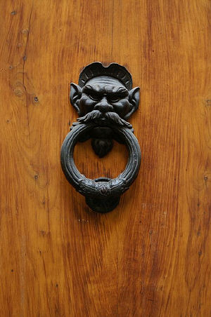
So, in the spirit of this being a new home, let me give you a little tour of the new digs. For starters, you like the new door knocker over there at the right? I sure do. That little guy comes from Florence, and I hope he’ll bring a little bit of Florentine flair to the front door. Unfortunately, I don’t think he brought any gelato with him (the rascal).
Oh, and to those of you who keep up with the website via the emails you get or your feed reader, I encourage you to click through and poke around the actual site for a bit to see what’s up.
- Featured Articles – While everything that’s posted on WhyGo Italy is interesting (naturaly), not everything is worth calling a feature. No, really, it’s true. With the new website design, I can give special attention to the posts that are particularly worth noting. You’ll find them near the top of the home page – the latest three features are highlighted, with the most recent one being showcased by whatever gorgeous picture of Italy it’s got in it. And if you want to look back at all the features that have run, you can click on the Featured Articles tag at the bottom of any feature post.
- Top Destinations – Yes, there are a zillion places to visit in Italy, but most people are looking for information on the top destinations in the country. So we’ve moved the list of the top destinations in Italy to the upper right-hand corner of the website so you’ll always be able to find them quickly and easily when you’re browsing around. What’s more, when you click on each destination, anything that’s relevant to that destination will also be listed in the upper right-hand corner as well. Pretty slick, eh?
- Articles – If it’s not a feature article, that doesn’t mean it’s not important and worth reading! Underneath the big feature article picture on the home page you’ll find a column called “Articles,” where non-features will go. The only posts that won’t be here are the “News” posts – but don’t worry, you’ll still get those via email or in your feed reader, and they’ll be linked from the “Resources” page as well.
- Italy Resources – Speaking of resources, this is another new group of pages to help you find what you want. Scroll down to the bottom of the home page and you’ll find “Italy Resources” listed in the right-hand column. The most sought-after topics are linked there, including things like getting plane tickets to Italy and sorting out accommodation options. Then, if you’re looking for the rest of the resources you’ll need, you just click on “More Resources” underneath that list and you’ll get a page with Italy resources from all over the website.
- Italy Deals – I’m particularly pleased about this part of the new design, because on the old one the “deals” that were listed were for all over the place… Now they’re all deals for Italy travel! You’ll find the latest and greatest Italy deals on the home page in the right-hand corner, under the list of “Top Destinations.” These will be updated as new deals come in, so it’s worth checking back often if you’re planning an Italy trip and hunting for bargains.
As I said, I’m still sort of moving in to the new site, and we’re also still working out the kinks. So if you find anything that doesn’t work like you think it should, or you’re having trouble finding something in the first place, please let me know. And let me know what you think of the new design, too!